
Rip Curl has launched a special collaboration for its 50-year anniversary with the mural artist Mad Steez, whose real name is Mark Paul Deren.
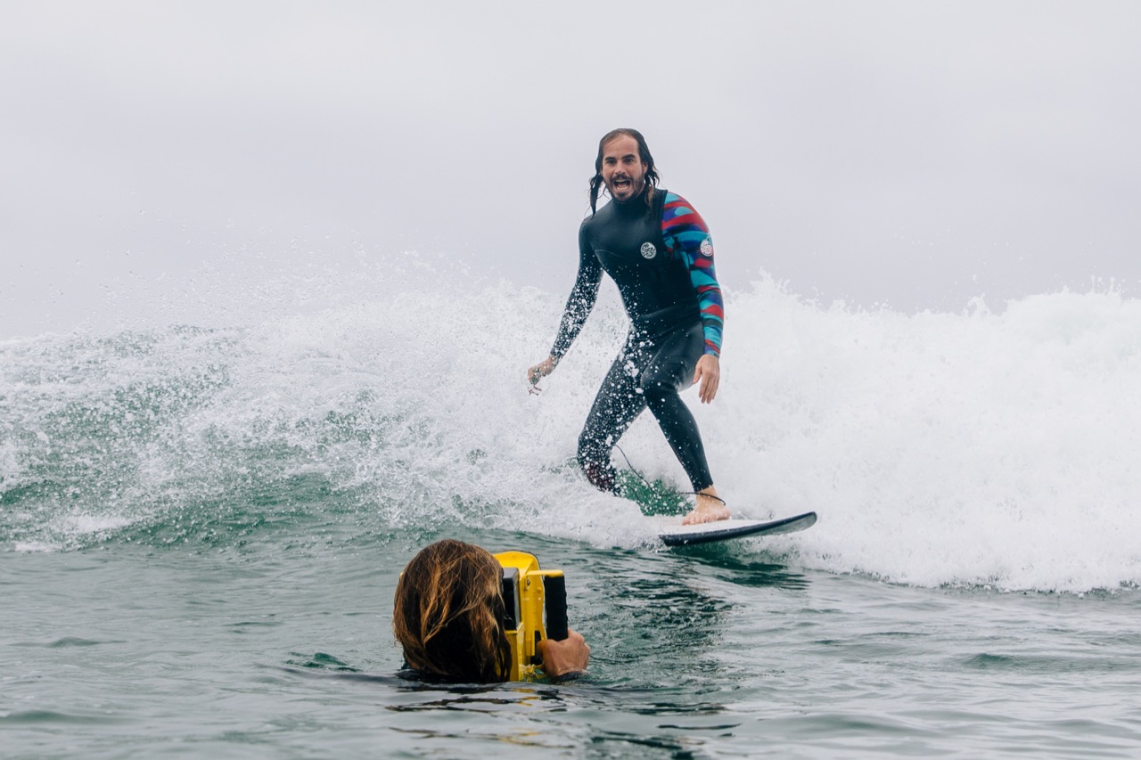
Mark is a surfer in addition to an artist, and because of vision impairment in his left eye, he sees the world through a different lens, according to Rip Curl.
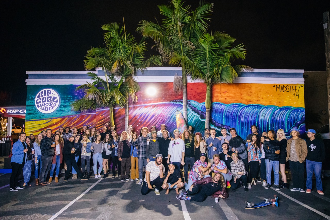
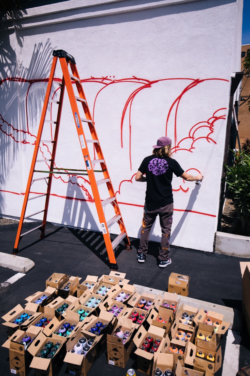
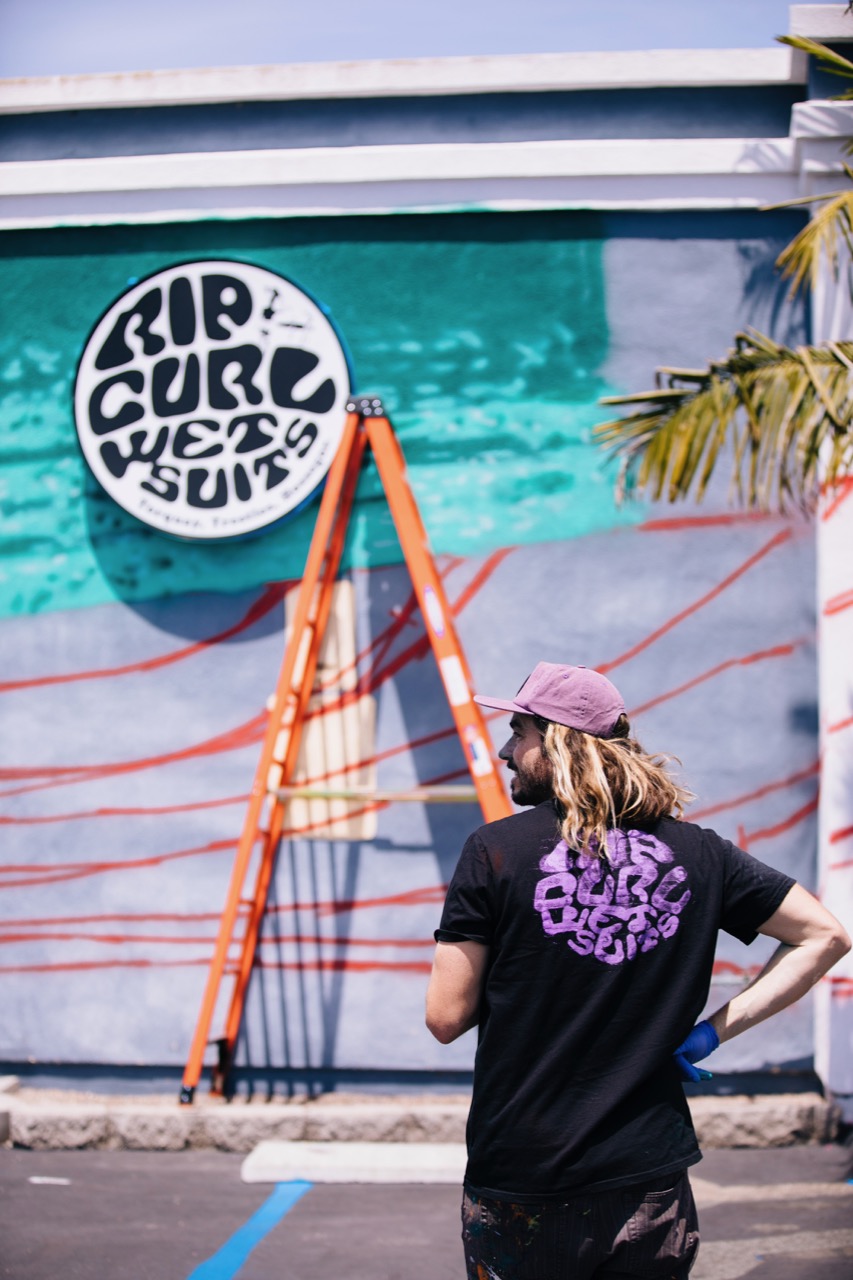
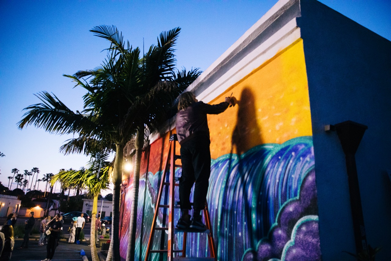
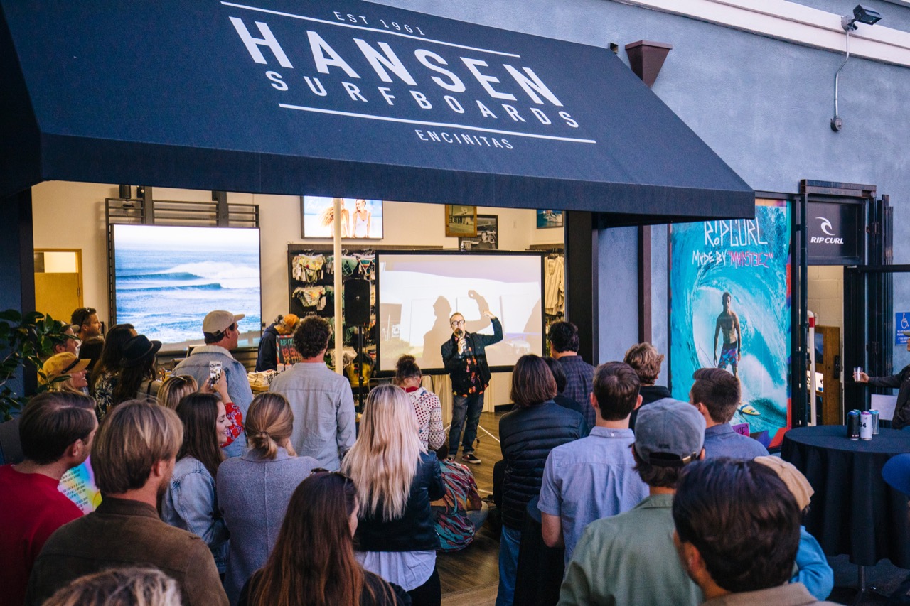
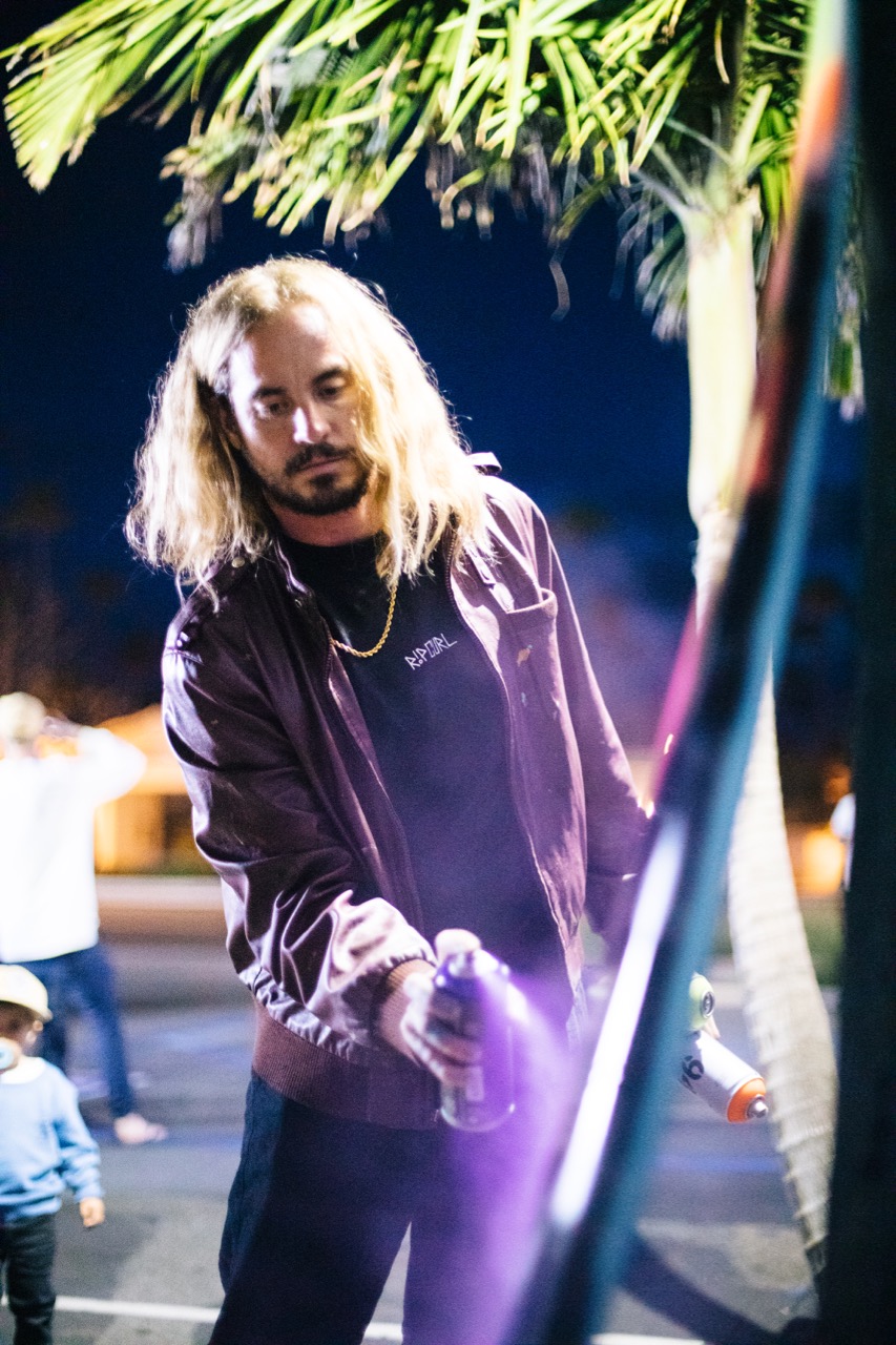
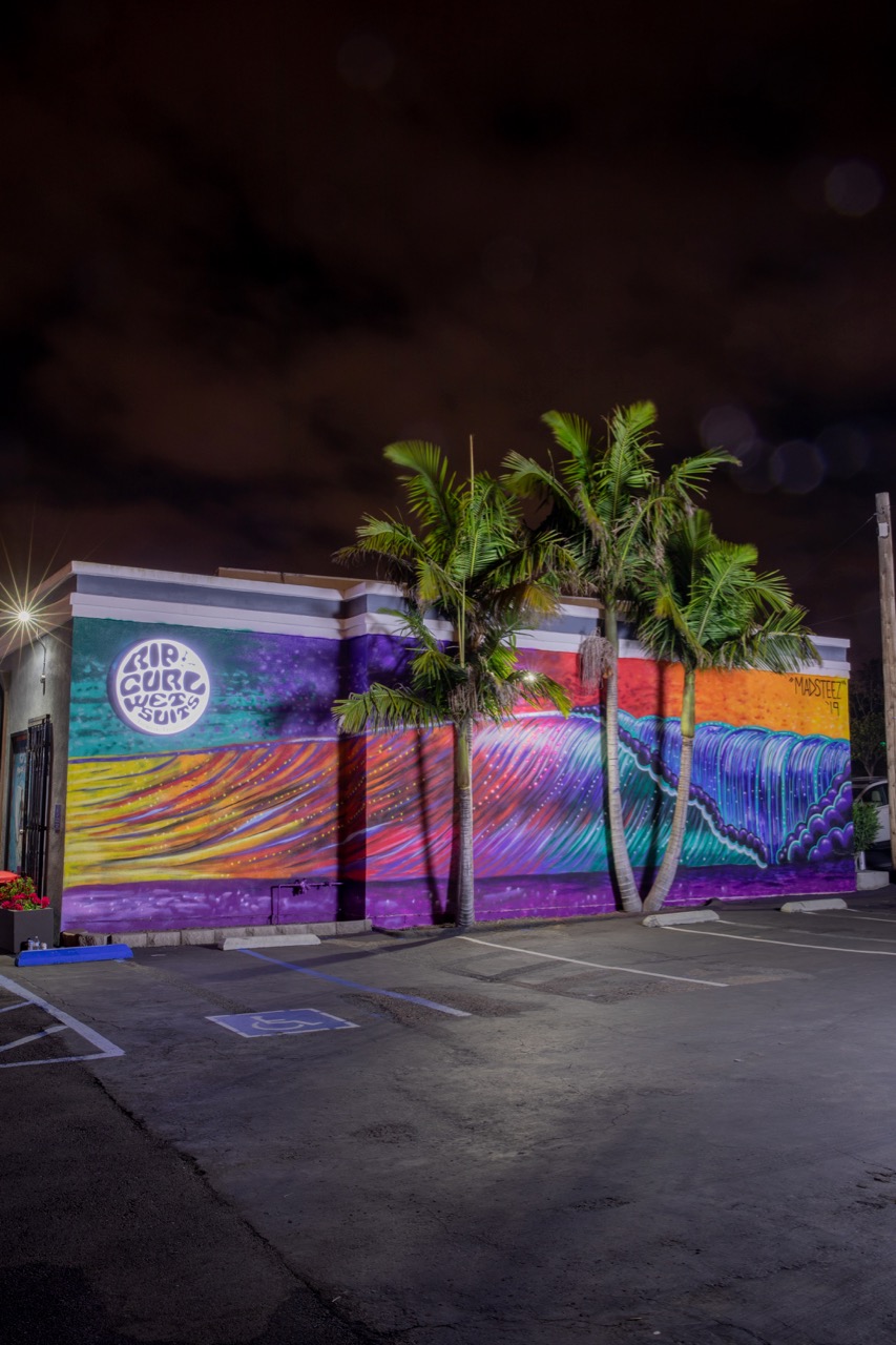
Rip Curl incorporated his art into the Rip Curl Pro Bells event, designed a collection of product incorporating his art, and is sending him on a worldwide tour to create murals in key surf cities. Last week, he created a mural at the Rip Curl/Hansen’s partnership store in Encinitas.
Rip Curl is such a believer in Mark that they allowed him to alter the company’s logos for the first time in Rip Curl’s history.

Rip Curl Group Creative Director James Taylor and Global Chairman of Men’s Surfwear Shawn Peterson answered some questions for us about the collaboration and why it’s a fit for Rip Curl.
How does Mad Steez fit with the Rip Curl brand image?
Rip Curl Group Creative Director James Taylor: The best collaborations are when both the brand and the artist complement each other’s strengths and weaknesses.
In this case, Mad Steez brings a street art style to our brand and we bring the surf. It is also critical that he rips himself.
How did you incorporate his art into the Bells event?
James Taylor: We had Steez create a fully painted wetsuit for all the team to wear during the Rip Curl Pro. We also had him paint our modern champions – Mick, Gabriel and Tyler – on the side of our headquarters building.
Lastly, we had Mason, whose Mirage boardshort was designed by Steez, at Bells to help activate the collaboration at the Rip Curl Pro.
When I think of Rip Curl, I think of an authentic surfing company, somewhat traditional (not in a bad way) on the creative side. Does this collaboration bring a new or different element to Rip Curl?
James Taylor: Irreverence is one of our brand values – with Mason and Steez together this was the perfect campaign to have some fun.
What categories are involved in the collaboration and why are those categories a fit?
Global Chairman of Men’s Surfwear Shawn Peterson: We included boardshorts, T-shirts, wovens, jackets, accessories and wetsuits.
Our core key products are boardshorts and wetsuits, so it made sense to ensure we covered these looks and then surround them with other categories.
How is his art incorporated into the product?
Shawn Peterson: We started with Mark’s signature graffiti style art then mixed that with Rip Curl’s surf DNA.
We came up with a signature print and a floral yardage that then was the common thread throughout the collection.
Is this a new design aesthetic for Rip Curl?
Shawn Peterson: Yes, it is definitely a new look for Rip Curl. The whole purpose was to think outside the box and have a fresh take on an artist collaboration.
Our Global Senior Boardshort Designer Mike Lonson brought the idea to the table. Mike and Mark are friends and thought of the collab, and the rest is history.
We wanted to partner with an artist but also a surfer. Mark has a passion for surfing so in the end it was a perfect fit for Rip Curl.
What kinds of stores are carrying the collaboration?
Shawn Peterson: Retailers across all distribution channels are carrying the product.
Is Rip Curl Women’s included?
Shawn Peterson: At this time it is just men’s.


